No.1 PSC Learning App
Comprehension:
Study the following table, (which shows the number of units of an item manufactured and sold by 5 companies) and answer the question.
Company | No of units Manufactured (in thousands) | Sold |
A | 42 | 30 |
B | 45 | 32 |
C | 36 | 26 |
D | 51 | 36 |
E | 54 | 40 |
Which Company sold the highest percentage of units as compared to manufactured by it?
Comprehension:
Study the following table, (which shows the number of units of an item manufactured and sold by 5 companies) and answer the question.
Company | No of units Manufactured (in thousands) | Sold |
A | 42 | 30 |
B | 45 | 32 |
C | 36 | 26 |
D | 51 | 36 |
E | 54 | 40 |
The ratio of the number of units manufactured by companies C and E together and the number of units sold by A and D together is?
Study the following table, which shows the number of units of a product manufactured and sold by a company in five years, and answer questions
Years | Number of units (in thousands) Manufactured | Sold |
2013 | 350 | 320 |
2014 | 375 | 315 |
2015 | 300 | 280 |
2016 | 450 | 423 |
2017 | 420 | 360 |
What percent of total units of the product manufactured in 2013 and 2015 is equal to the total units unsold during the five years? (correct to one decimal place)
Study the following table, which shows the number of units of a product manufactured and sold by a company in five years, and answer questions
Years | Number of units (in thousands) Manufactured | Sold |
2013 | 350 | 320 |
2014 | 375 | 315 |
2015 | 300 | 280 |
2016 | 450 | 423 |
2017 | 420 | 360 |
The ratio of the total number of units sold in 2014 and 2015 to the number of units manufactured in 2017 is:
Study the following table, which shows the number of units of a product manufactured and sold by a company in five years, and answer questions.
Years | Number of units (in thousands) Manufactured | sold |
2013 | 350 | 320 |
2014 | 375 | 315 |
2015 | 300 | 280 |
2016 | 450 | 423 |
2017 | 420 | 360 |
In which year the number of units of the product sold is 19000 less than the average number of units manufactured per year?
The following pie diagram gives the marks scored by a student in different subjects in an examination. Assuming that the total marks scored by the student in the examination are 540, answer the question below
The subject in which the student scored 123 marks is:
The given bar graph represents the Percentage of non-electrified villages in 6 states A, B, C, D, E and F. Study the graph and answer the question that follows.
How many states have at most 30% or less non-electrified villages?
The line graph shows the scores of a batsman in 6 matches. In how many matches was his performance better than the previous match?
The bar graph shows the number of cars sold by a distributor in each month from January to June.
How many more cars did he sell in the second quarter as compared to the first?
The given pie-chart represents the percentage of students enrolled in five different sports. The total number of students is 2800.
If 24 students playing cricket are shifted to Kabaddi, then find the new ratio of the number of students in Cricket to those in Kabaddi.
Study the given bar chart and answer the question that follows. Production of Fertilizers by a Company (in 10,000 tonnes) Over the Years
What was the approximate percentage increase in the production of fertilizers from 1998 to 1999 ?
The given pie-chart represents the percentage of students enrolled in five different sports. The total number of students is 2800.
What is the average number of students enrolled in Hockey and Tennis together ?
The given chart shows the number of students in Class 4, Class 5, Class 6 and Class 7 who got first class, second class and failed in the final examinations.
Which class has the highest number of students who passed?
The given chart shows the number of students in Class 4, Class 5, Class 6 and Class 7 who got first class, second class and failed in the final examinations.
What is the pass percentage of Class 4?
The given chart shows the number of students in Class 4, Class 5, Class 6 and Class 7 who got first class, second class and failed in the final examinations.
Which class has the least number of students who passed?
50 കുട്ടികൾക്ക് ഒരു പരീക്ഷയിൽ ലഭിച്ച സ്കോറിനെ കുറിച്ചുള്ള വിവരങ്ങളാണ് താഴെ പട്ടികയിൽ കൊടുത്തിരിക്കുന്നത്
60 മുതൽ 69 വരെ സ്കോർ ലഭിച്ച എത്ര കുട്ടികളുണ്ട് ?
Performance of 1800 students in grades has been shown in the following pie chart. The number of students getting grade B is what percentage of the number of students getting grade A?
Marks | number of students |
1 - 20 | 10 |
20 - 40 | 40 |
40 - 60 | 15 |
60 - 80 | 12 |
80 - 100 | 30 |
What is the ratio of the number of student between 20-40 and 80-100 marks?
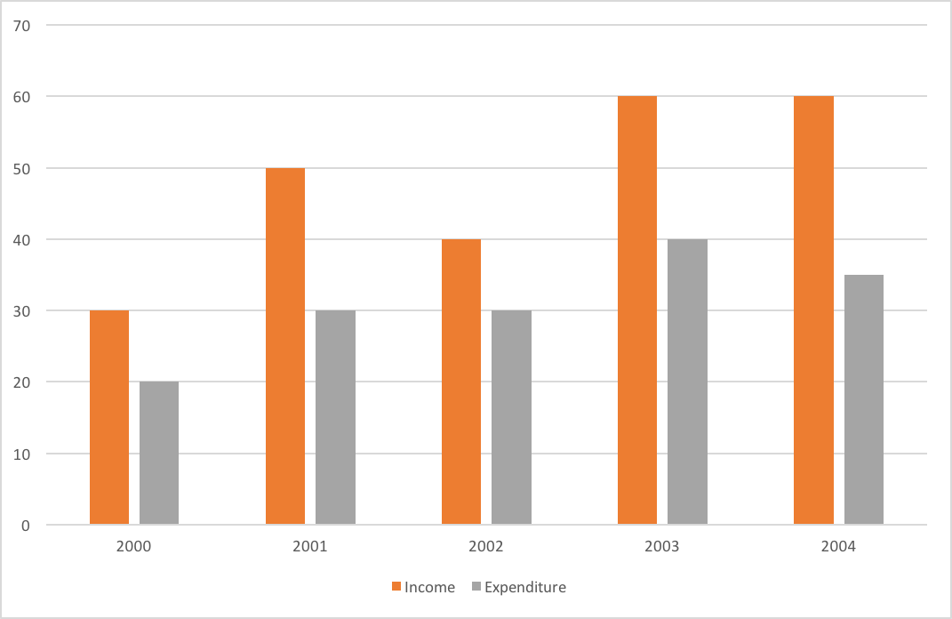
The graph shows Income and Expenditure(Rs. in lakhs) of a company.The number of years in which the income exceeds the average income is :
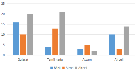
The number of mobile simcards in 4 states are given in multiple bar diagrams.In which state are there the largest number of owners of Airtel simcard ?#
The graph shows Income and Expenditure(Rs. in lakhs) of a company.The expenditure from 2002 to 2003 increased by:
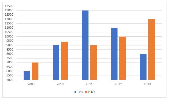
The number of the production of electronic items (TVs and LCDs) in a factory during the period from 2009 to 2013.The total number of products of electronic items is maximum in the year?
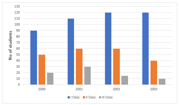
The graph shows the result of 10th class students of a school for 4 years.
The year in which the maximum number of students appeared for the 10th class exam is:
The following pie-chart shows the number of students who failed in different subjects in an examination, Examine the chart and answer the following questions. The total number of students who have failed in 500.

The number of students failed in science is less than the number of students failed in all other subjects by:
The line chart given below represents the revenue (in Rs. Crores) of a company for 6 years.What is the percentage decrease in the revenue from year 2011 to 2012?