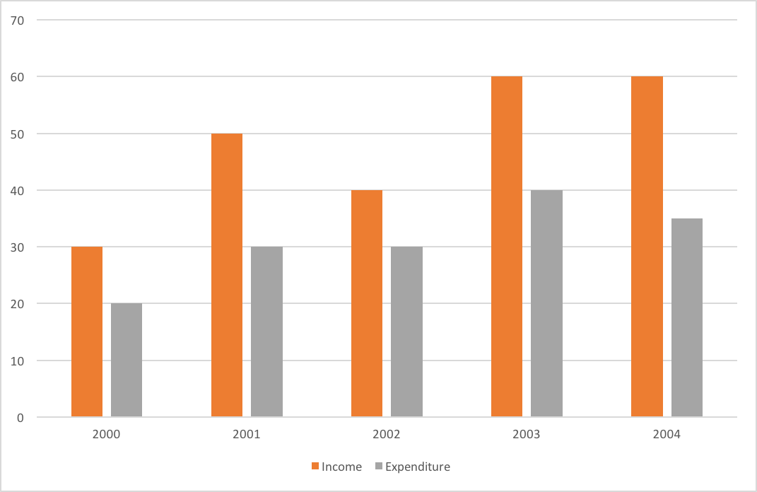
The graph shows Income and Expenditure(Rs. in lakhs) of a company.The expenditure from 2002 to 2003 increased by:
A10%
B20%
C25%
D33 1/3%
The graph shows Income and Expenditure(Rs. in lakhs) of a company.The expenditure from 2002 to 2003 increased by:
A10%
B20%
C25%
D33 1/3%
Related Questions: